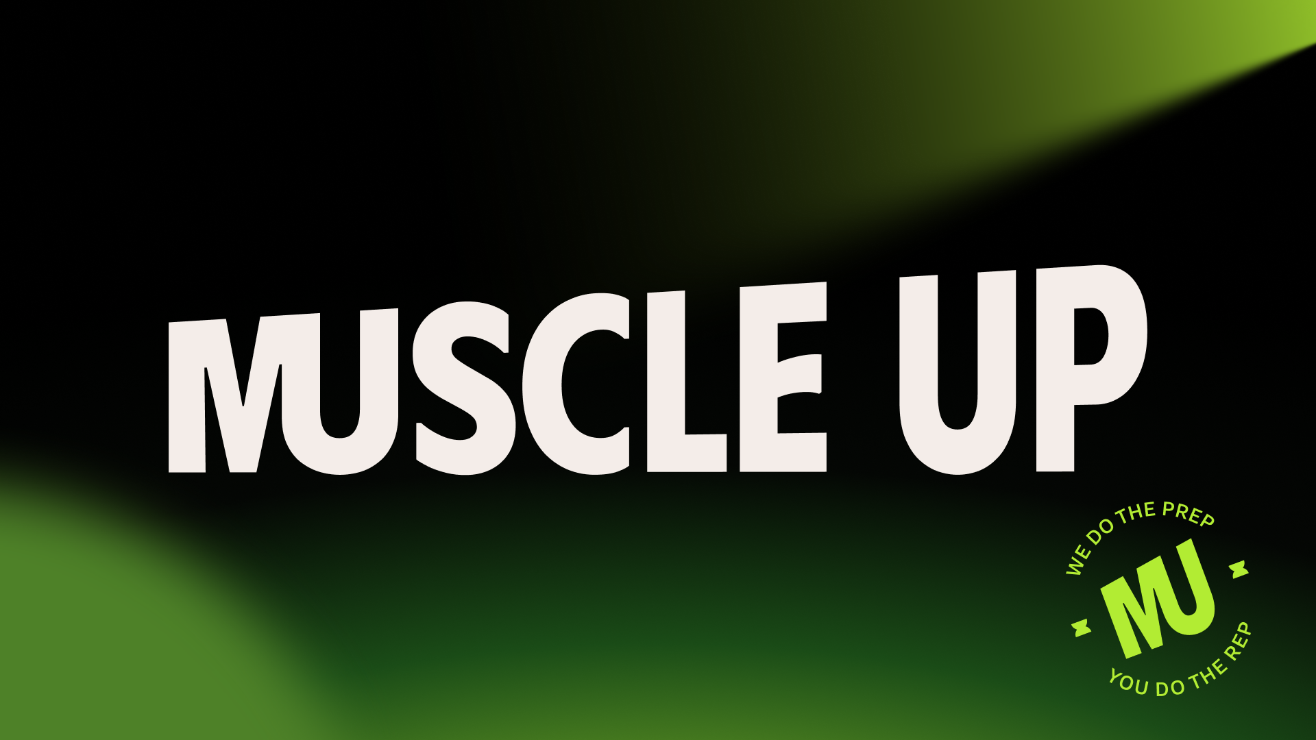
Muscle Up
Branding
2024
Description
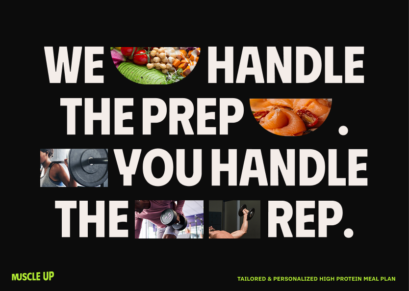
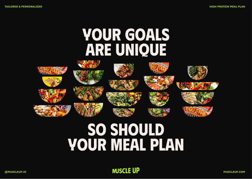
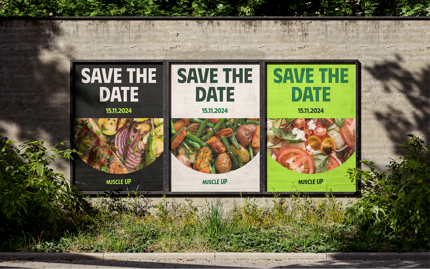
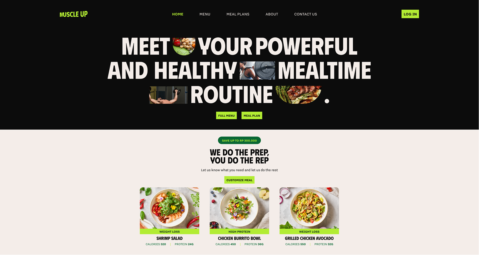
Created a full brand identity for a meal subscription concept built around quiet, reliable support for fitness focused users. The work covered visual direction and messaging, shaped around the idea of a service that acts like a trusted butler for your muscles and reinforces progress with steady guidance.
Behind the Identity
The letter M & U combined in the logo is designed to visually show both a person flexing their right arm and a butler in a serving pose. This dual meaning reflects the audience’s goals and the brand’s supportive role.